Understanding proportion in design
by Wynn Bell
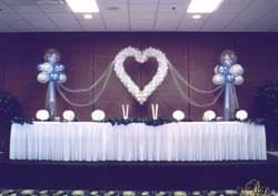 |
| Heart and two Fantasy Clouds – Very good proportions of 4′ heart and the Fantasy Clouds to the 12′ ceiling, even with the table on a 2′ riser. |
Why is it that when one is cooking, getting all the ingredients in the
correct proportion is of the greatest concern, and yet when building balloon
décor, we many times forget about the proportions of all our ingredients. In
cooking, one winds up with a finished product that either looks and tastes
good or it doesn’t. The same can happen with balloon décor. Why this
happens can be a mystery to many people. With a little thought and planning,
however, getting the correct proportions in balloon décor is relatively
simple.
By definition, proportion is defined as the balanced relationship of all the
parts to the whole, either visual or structural. In other words, the
relationship between the sizes and numbers of balloons, between the
individual pieces or parts of the décor, and between the individual sections
of the décor. Along with scale, how the pieces all fit within the venue is
also part of proportion. We see good and bad examples of proportion all the
time, and yet never seem to get it right every time. “Why?,” you may ask.
Let’s start with a simple example; a balloon centerpiece on a table with 3
helium filled balloons. No matter the size or type of balloon, if the tie
down (weight) is there only to hold the balloons down, chances are it will be
small. Immediately, one can see that the visual proportions are way off both
between the balloons and tie down and between centerpiece and table. This
results from there not being a balance between the sizes of the balloons and
the tie down. Just by using materials that give visual size to the tie down,
the centerpiece suddenly has better proportions.
Let’s look at some examples:
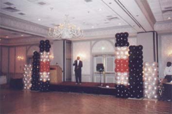 |
| Proportion and scale are very good. No toppers on columns because when added, they threw off the proportion. |
- A classic décor column made with quads at 9-10″ and 8-10′ tall will have
better proportions if the topper on the column is 30-36″ in diameter or
height. Placing an 18-20″ mylar or a 16″ latex on top of this column is not
giving good proportion to the column. - A 4′ heart frame with 6″ balloons wrapped on it will very likely not have
good proportions as the balloons may completely overpower the sculpture.
If the frame were 5-6′, then the 6″ balloons would work much better. By
making sure the ceiling is high enough for this larger heart, it’s proportion
and scale to the room also will work better. - Building those fancy wedding décor columns for the corners of dance
floors also can be tricky. Keeping the bottom and top balloons from
completely overpowering the center of the column, or the entire column
itself, is of great importance. Sometimes it is balloon size, and sometimes
it can be the actual height of the column that throws the proportion out of
balance. - How many times have we seen bride and groom sculptures at the entrance
to a wedding reception, and stopped and looked, trying to figure out why
they did not seem right? Then we realize that the heads just didn’t
fit the bodies. So many times the head is just too small. - Tall balloon cluster sculptures like Nutcracker’s, Santa Claus, athletes,
etc., are extremely sensitive to proportion. Using 6-balloon clusters will
help smooth out the overall look. This many balloons will also make it
easier to add facial features to the sculpture. Many times the balloon size
can be smaller, adding to the overall smoothness of the entire sculpture.
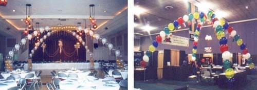
Two examples of good proportion within large spaces. Wedding
décor with 20′ ceiling. Booth in convention center with 16″
balloons, 30′ ceiling. - As we get into topiary sculptures, we run an even greater risk of having
the proportions not being correct. We watch the scale of the balloons to the
size of the entire sculpture, and we watch the size of the sculpture to its
surroundings, but we don’t watch the proportions of the sculpture itself. We
get arms that are too long, faces that are distorted (this is separate from a
purposely distorted face), bodies that are too long, hands that are either
too big or too small, etc, etc, etc. We may even forget to allow for the
size of the balloons being tied to the framing, which will throw off the
proportions of the sculpture. The first horse topiary sculpture we built for
the Cinderella’s coach sculpture is a very good example. When I got the
framing completed, we had a beautiful horse. After tying the 4″ balloons all
over the frame, our horse looked more like a distorted plowhorse. The neck
had become very thick, the legs very pudgy, even though the body really
looked like it was OK. We had forgotten about the differences in proportions
that the balloons we were tying onto the sculpture would make.
We, as balloon artists, are also décor designers and planners. This means
that care must be taken to include the proportions of the room or venue in
which our décor will be used. The actual proportions of the venue must be
taken into account at every turn. This may seem to border on a discussion of
scale, as both are closely related, but there is a difference.
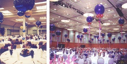 |
| Even though they are only on every other table, the low ceiling makes both the scale and proportion to the one room bad. By contrast, the large room (30′ ceiling) has 100 tables, with a balloon on each table. Varying the heights of the balloons helps the overall scale and proportion be correct. |
The use of the proportions of the room in designing and building décor is
really brought to mind from some of our earlier experiences. One in
particular involved a wedding in the auditorium in a private hall. The room
was designed for about 200 people seated at long tables. The bride decided
she wanted rounds, so they used every 4ft cocktail table they could find, and
even rented a few 60″ rounds. That might have been all right, except that
they were expecting about 275 – 300 guests. To make matters worse, she
wanted balloons on EVERY table. Had we had enough knowledge to realize that
3 balloon centerpieces with all the balloons the same height was going to be
such a visual disaster, we could have made some design changes. Had we used
larger balloons at varying heights, we could have had this “sea of balloons”
match the proportions of the room much better. After we had completed the
job, we were almost embarrassed at what we had done. Fewer balloons would
have fit the proportions of the room much better.
How do we avoid these situations? Planning and attention to detail is the
best way. Take an extra hour and plan out how you really want that
centerpiece or bouquet to look. Do you want to use just a sand weight as a
tiedown or do you want to use a fancy shopping bag, or fold up a large piece
of cellophane or mylar paper? Would the bow tie on that groom have better
proportions if it was made from a 160Q instead of a 260Q, or maybe made from
cloth? Should we downsize the balloons in the column so that we can use
that really neat, but somewhat small mylar star, on the top, or should we
find a larger balloon for the topper? Will that walkthrough heart be
correct at 10′ tall, by using 4″ balloons to cover the frame instead of 8″ or
9″ balloons?
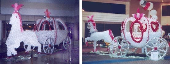 |
| Obvious differences of good and bad proportions as mentioned earlier. |
Getting the proportions right, and then making sure that all the details are
finished, can be the difference between a very exciting and visually correct
piece of décor or just another “balloon display.” We owe it to ourselves,
and our customers, to ALWAYS get the proportions right.
Wynn, signing off, hoping all our balloon décor gets better as we pay more
attention to PROPORTION.
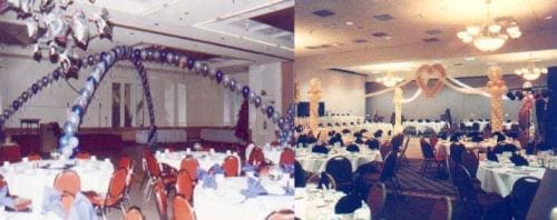 |
| The String of Pearls arches are too flat for the ceiling height. This décor would have better proportion if the columns were closer together in this room. The Cherish Heart Canopy needs either the columns closer together or the heart to be raised 3-4′ higher. Small details that would have greatly improved the décor in both rooms. |
